The point of this post is not to do a walkthrough of the new GitHub Issues experience (it’s awesome by the way!), but rather to think about what I believe is the reason and the ethos of the feature. It was inspired by a conversation with colleagues which I believe was worth sharing.
As developers, we got used to the sticky note experience - the requirements you are aware of are summarised with a sticky note, with a title, and no other information is brought to the forefront of what you see as the first impact. Hence the Azure Boards experience, in a nutshell, where the complexity of the requirement sits a level below view.
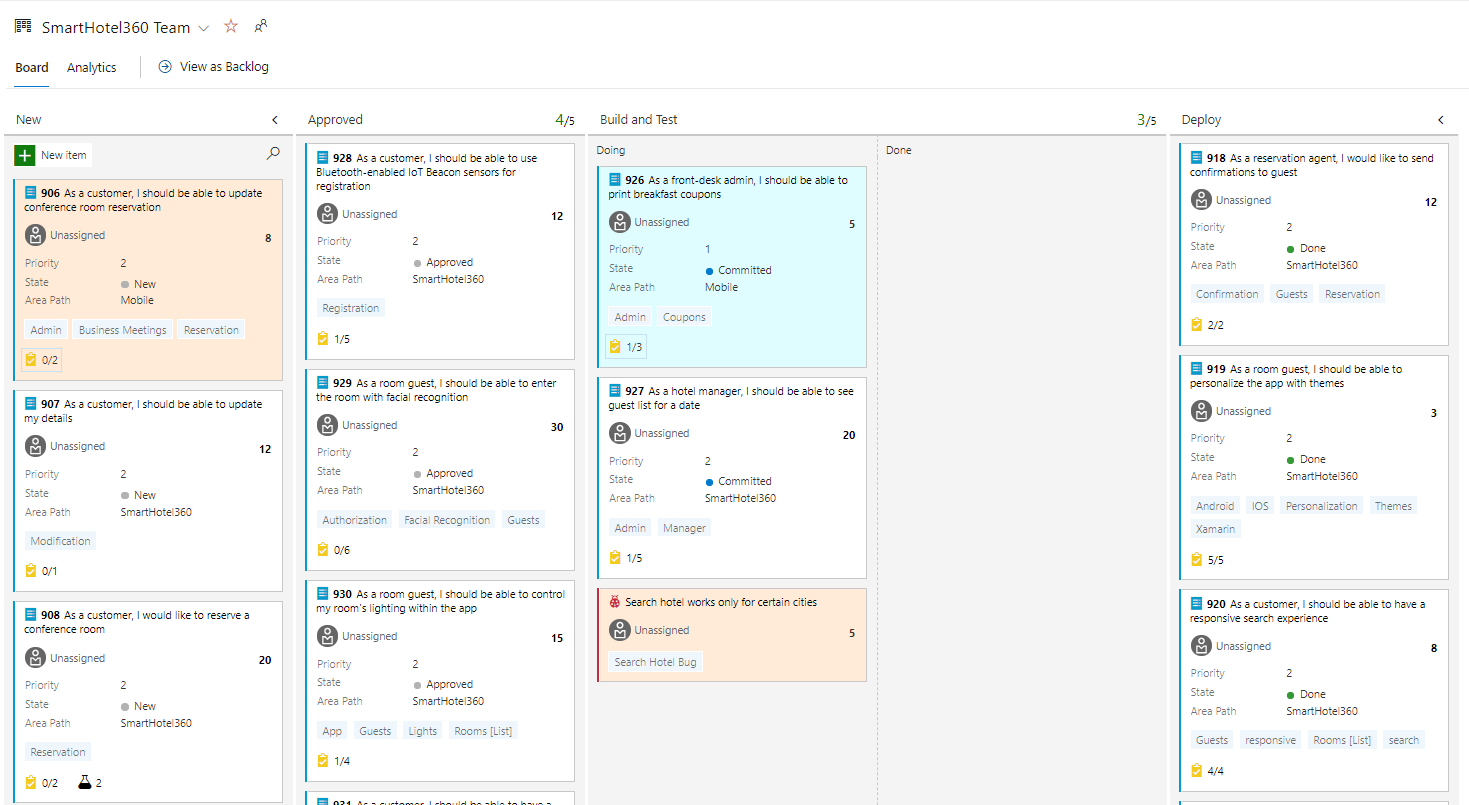
The reason why I like Azure Boards so much is that you are just one level away from all the details, compared with other tools. However, I like it because I am used to go back and forth between backlogs, teams and projects. This experience acts as a common denominator across projects and organisations, with an agreement saying that if I need more information about an item I can click on it and get it all.
Brilliant, but not really practical from an individual perspective. Why? Because of the context switch between the overall status and the actual progress. If you want to switch from a board to a list (the backlog?) you literally need to move from a place to the other. Context switch is expensive in both computer programming and human behaviour.
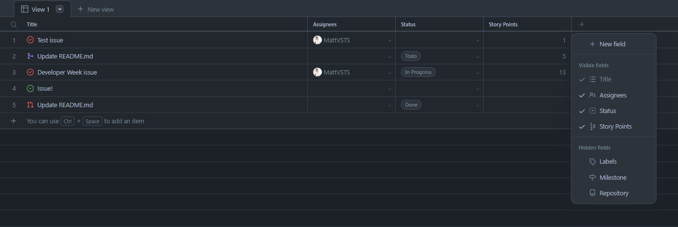
GitHub Issues doesn’t do that - you can customise a tabular view with all the key information:
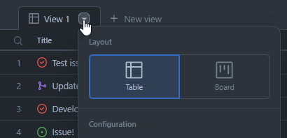
And by clicking on the arrow you can immediately switch to a board view:
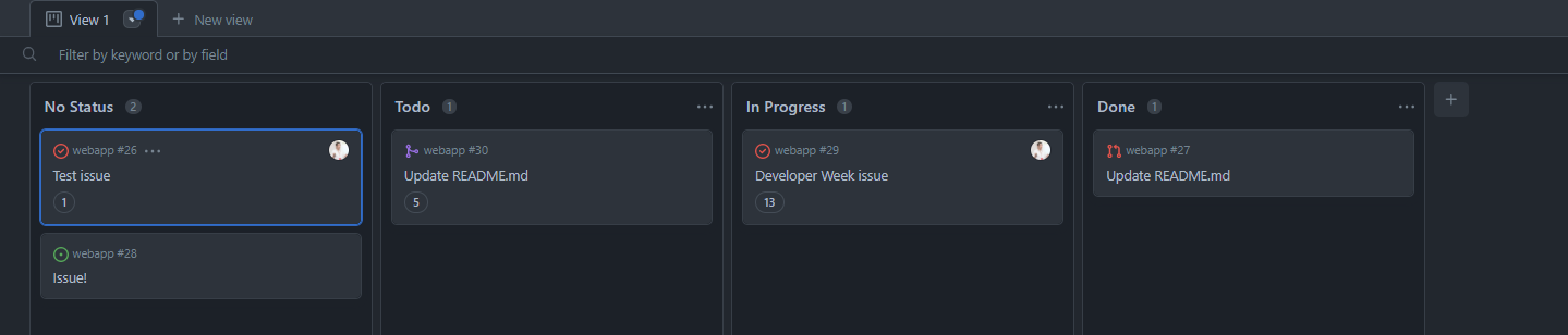
which will contain the same information in a different visualisation, without forcing you to context switch between the two:
Now, there is no better way. GitHub Issues gives you something different, which you can customise and integrate with other tools. Some people might like it in a way, some others might prefer another one.